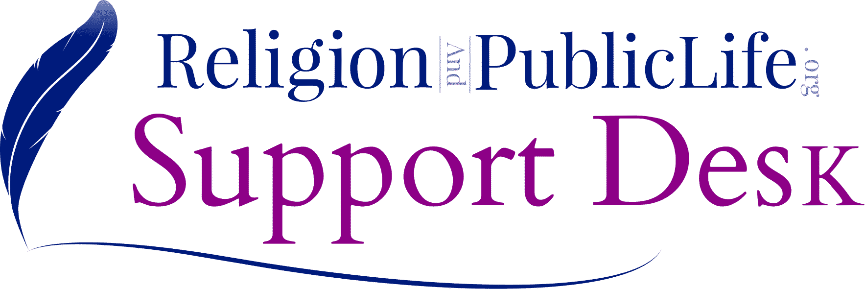
Logo Use Policy
See the Study Guide for illustrations of this policy.
The ReligionAndPublicLife.org logo should maintain a good margin allowing it to breathe around other objects. Using the height of the R or P in the logo as an increment of X space around the logo. To achieve this using Elementor, add 30px padding around the image.
Design Features
- The word "Religion" is represented in Dark Magenta (#8C0087).
- The Feather, stroke, and "PublicLife" is colored in Resolution Blue (#001C7D).
- The "And" and ".org" is colored with Resolution Blue (#001C7D) at 40% opacity.
- Overall, this formula ensures the logo only uses two colors for simplicity.
Do Not
- Change the color of the logo
- Place the colored logo on a colored background or layered overtype of a pattern or image.
- Rotate, flip, or distort the logo.
Okay
- The contrast should be high enough that the brand is easily legible on background colors. Use a black or white logo version to achieve this contrast.
- Only white or black logs can be used to overlay background colors or images that not of high contrast.
- Only the colored logo can be used if the background color allows it for high contrast ratio. Do not use colors that are outside the suggested brand guide.
Website Use
- Logo should never be smaller than 32px in height.
- Logo on the site will be 80px in height just above the main navigation.
- If the logo is to be used with content, then it should be sized proportionally and adhere to the margins set. Scaling of the log should be increments of 4px for web use.
Print Use
- The logo should never be smaller than 1" in height. The color logo can be used for color-printed materials.
- The Black version of the logo should be used for all stationary printed materials. It should not be smaller than 1" in height.
- Printed materials should use a logo that has a resolution of 150dpi minimum.
Nate Walker is the author of this solution article.
Did you find it helpful? Yes No


